 Rahul Kulathoor
04Fintech · Investment Platform
DIP Trading
Landing page & dashboard design
- My role
- UI/UX Design · Visual Design · Interaction Design
- Project type
- Landing Page & Dashboard Design
- Category
- Fintech · Investment Platform
- Live site built with
- Next.jsDevelopment handled separately
01Overview
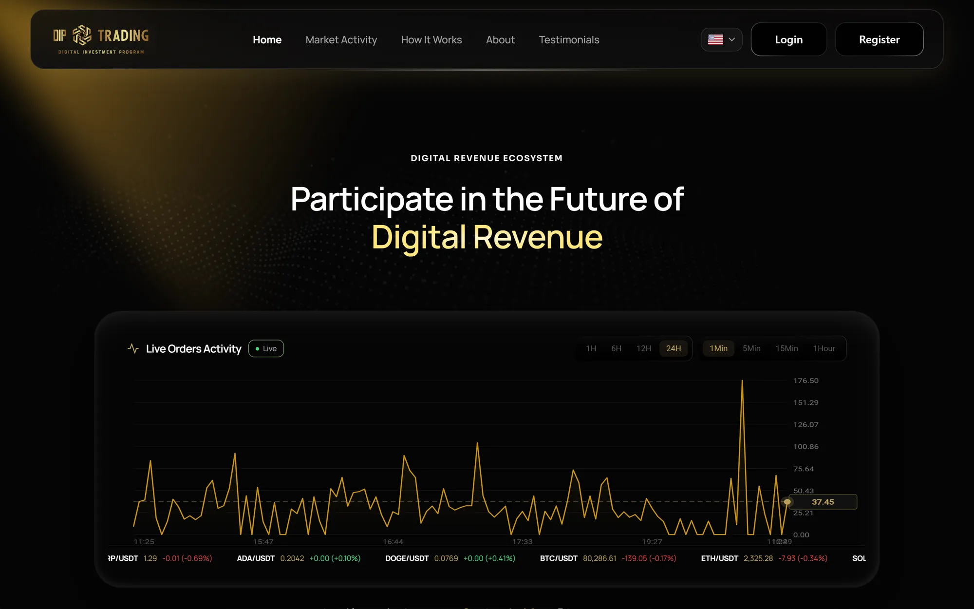
DIP Trading is a digital investment platform designed to bring clarity and structure to a complex financial experience. I designed the landing page and dashboard experience with a premium black-and-gold visual language, focusing on clear information hierarchy, intuitive navigation, and meaningful interactions.
Visit Live Website02My role
UI/UX Design · Visual Design · Interaction Design
- 01UI/UX Design
- Shaped the experience across the complete landing page and dashboard, from structure to final screens.
- 02Visual design & direction
- Set the black-and-gold visual language, typography and interface details used throughout the project.
- 03Landing page design
- Designed the complete landing page in Figma.
- 04Dashboard interface design
- Designed the dashboard interface in Figma.
- 05Interaction design
- Designed the interactions and UI states for the different dashboard areas.
- 06Flows & usability
- Worked through user flows, interface hierarchy and usability considerations across both experiences.
03Visual direction
A premium black-and-gold design language
A dark interface lets financial information carry the page, while a single gold accent signals what matters. The same visual system runs through the landing page and the dashboard.
Black
#050505
Card
#101010
Gold
#BCA15E
Rich gold
#D4A44A
Light gold
#DFBF57
- 01
Dark interface
Near-black surfaces keep the interface calm and let data, charts and key actions stand out.
- 02
Gold accents
Gold is used sparingly, for emphasis, highlights and key figures, so it keeps its weight.
- 03
Typography
Refined, restrained type gives headings and figures a clear order without decoration.
- 04
Contrast & spacing
Generous spacing and strong contrast build a visual hierarchy that is easy to scan.
04Landing page
Landing Page Design
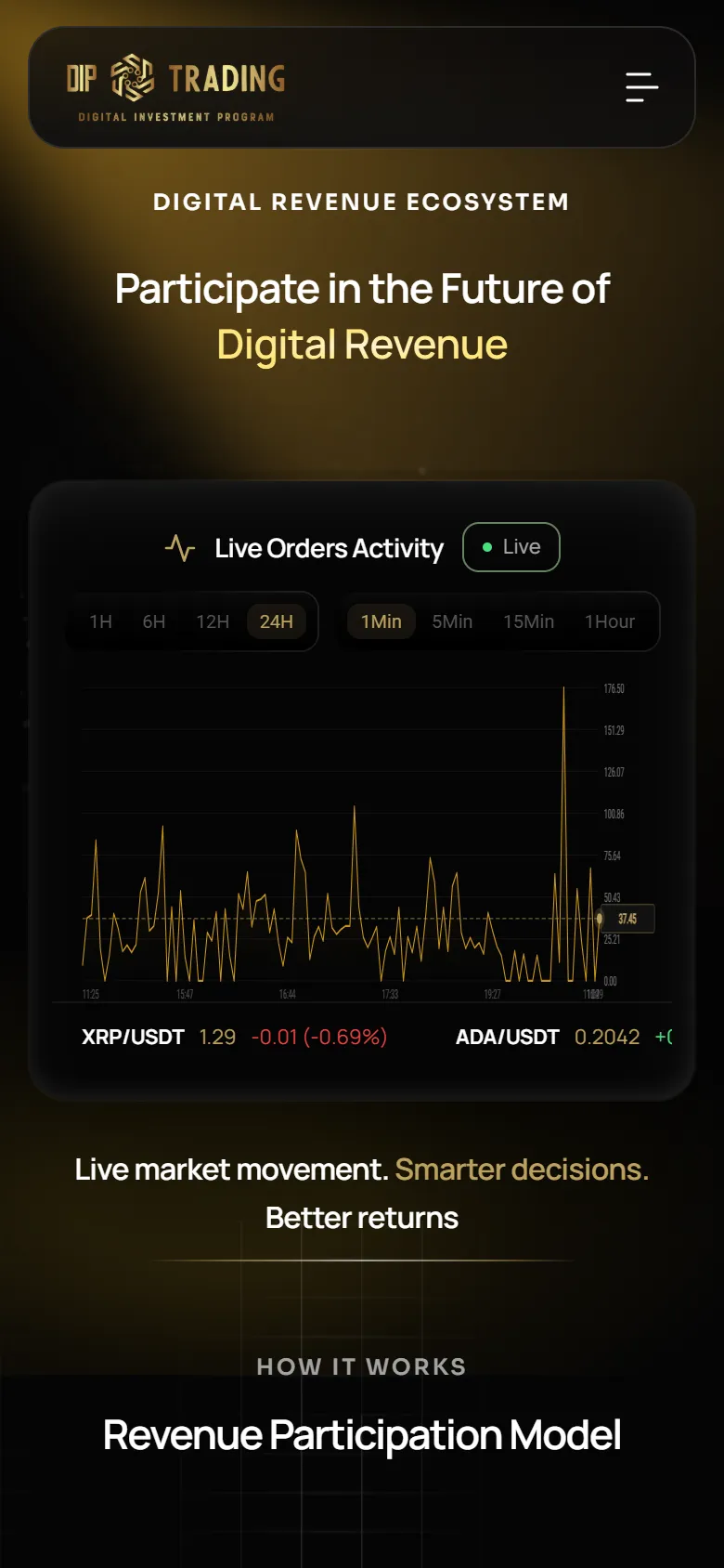
The complete landing page, designed in Figma, introduces the platform and its participation model in the same black-and-gold language as the product. Screens below are from the live site built from the design.
Use the left and right arrow keys, or swipe, to move between screens.
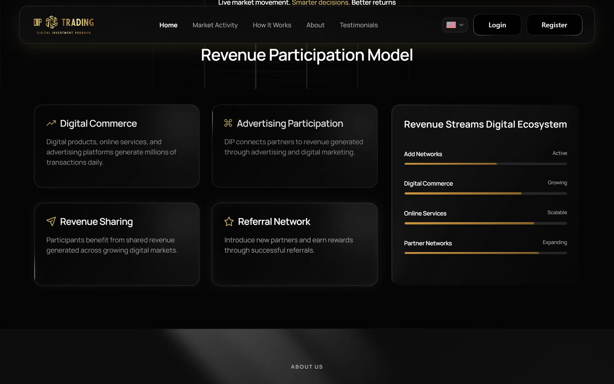

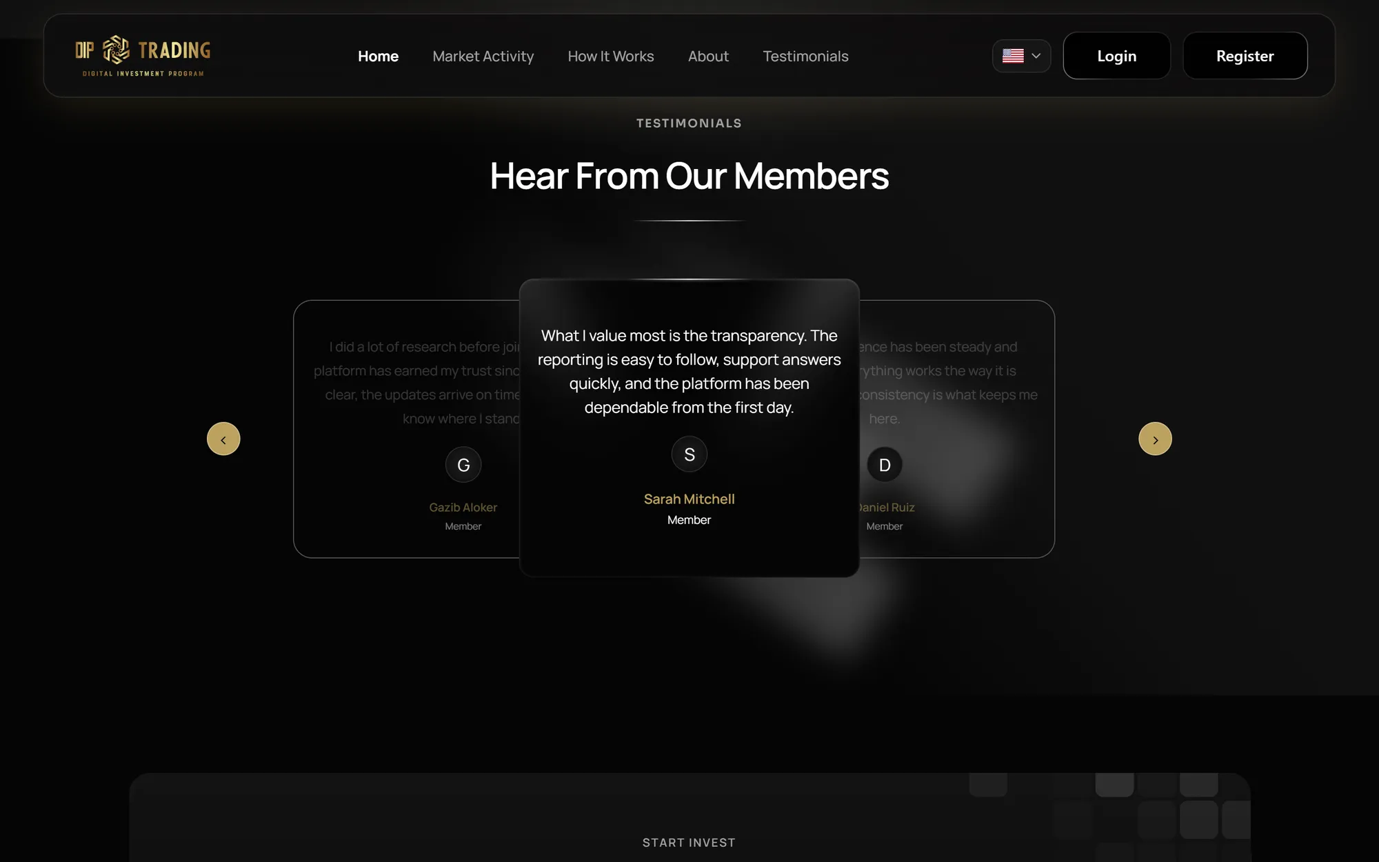
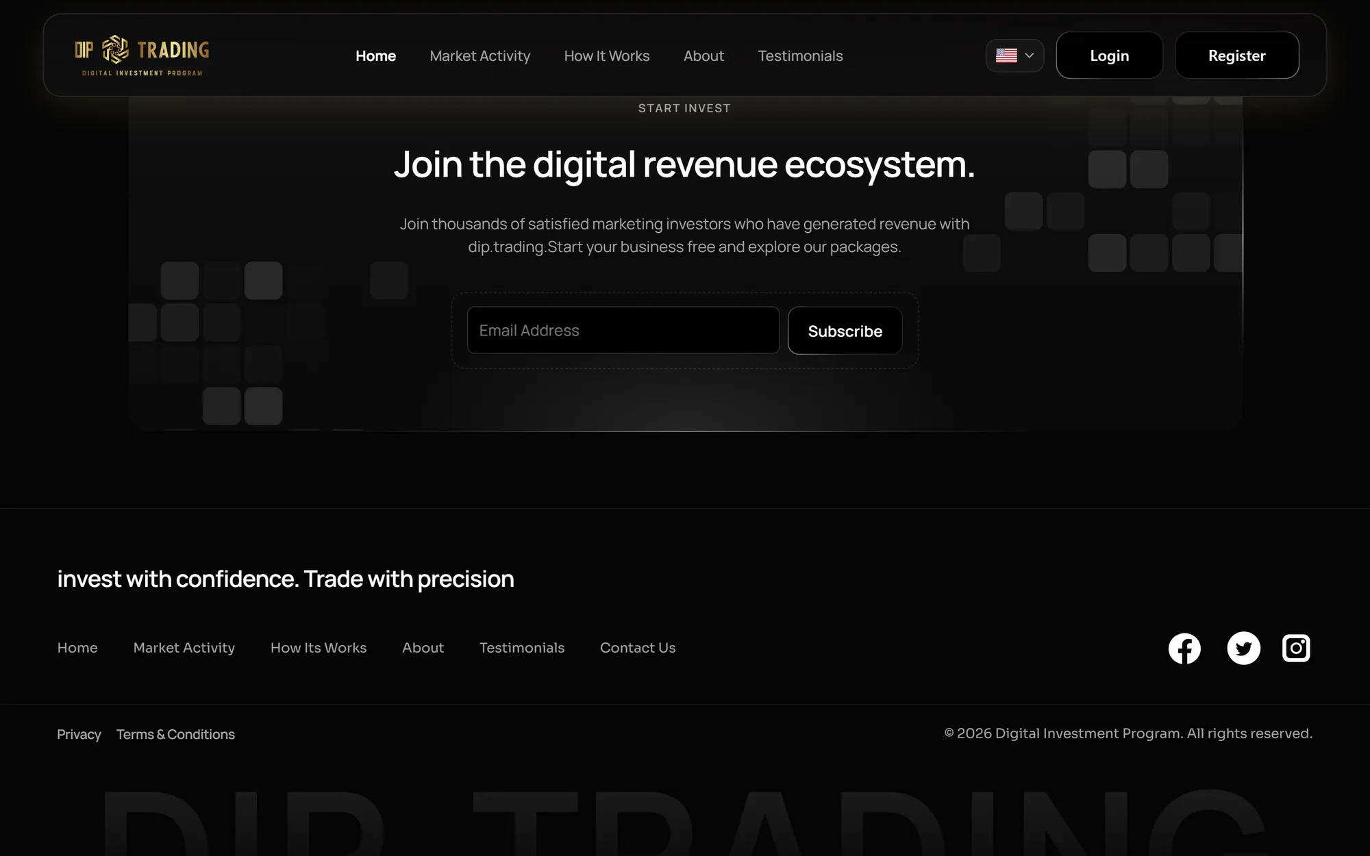
01 / 06Hero — live orders activityOpen full size ↗
05Dashboard
Dashboard UI/UX Design
The dashboard is the core of the experience: an overview of portfolio performance, with dedicated screens for earnings and activity, investment plans and withdrawals.
- 01
Information hierarchy
Key figures — portfolio value, available balance, total returns and active investments — lead as summary cards, with charts and recent activity beneath.
- 02
Navigation
A persistent sidebar groups Finance and Account areas, while primary actions — Withdraw and New Investment — sit at the top of the dashboard.
- 03
Financial data presentation
Transaction charts, an ROI gauge, a portfolio breakdown and start-to-maturity progress make the numbers quick to read.
- 04
Interface consistency
The same dark cards, gold accents and outlined icon tiles carry through the dashboard, finance, investment and withdrawal screens.
Use the left and right arrow keys, or swipe, to move between screens.
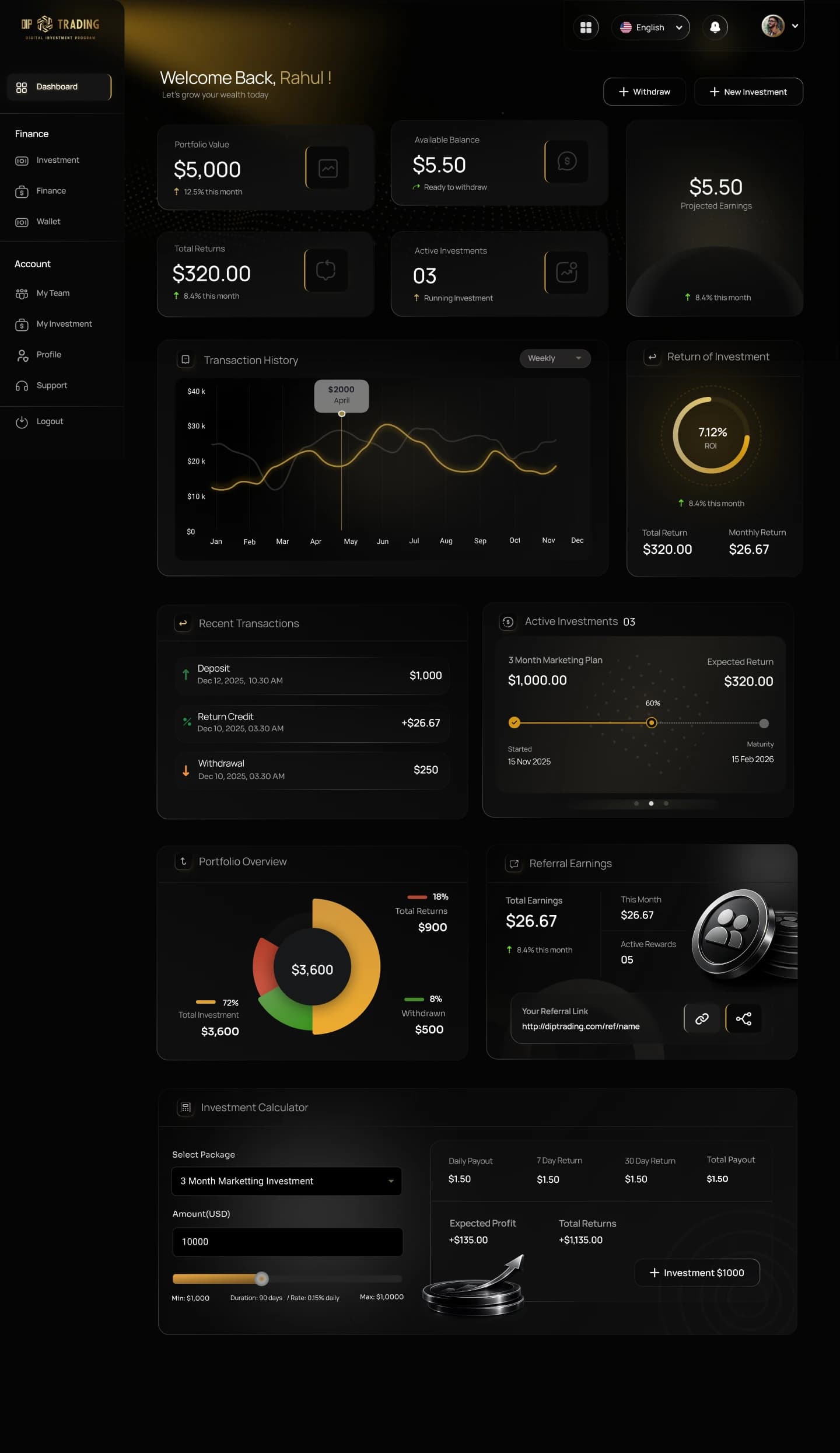
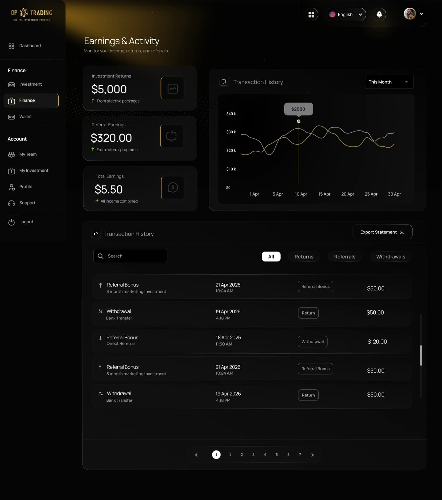
01 / 06Dashboard overview — portfolio, returns and activityOpen full size ↗
06Interaction design
Interaction Design
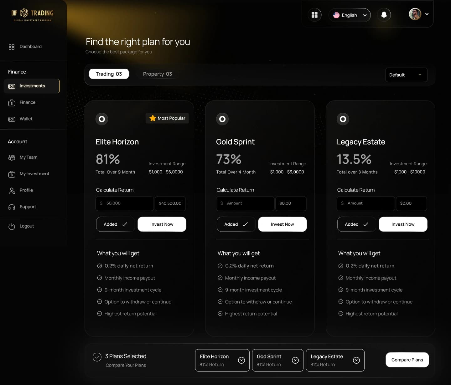
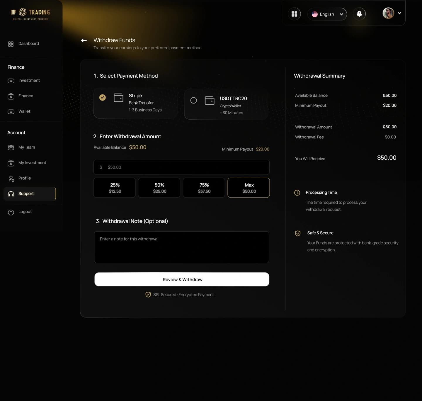
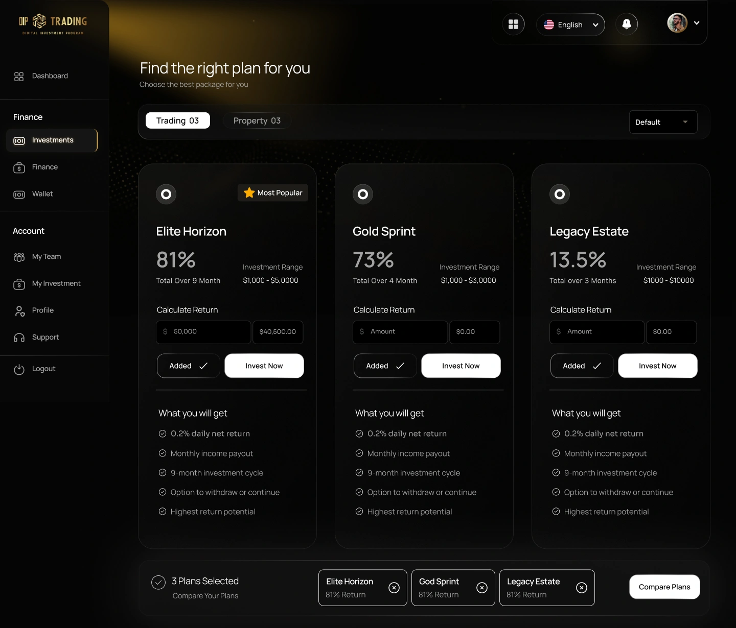
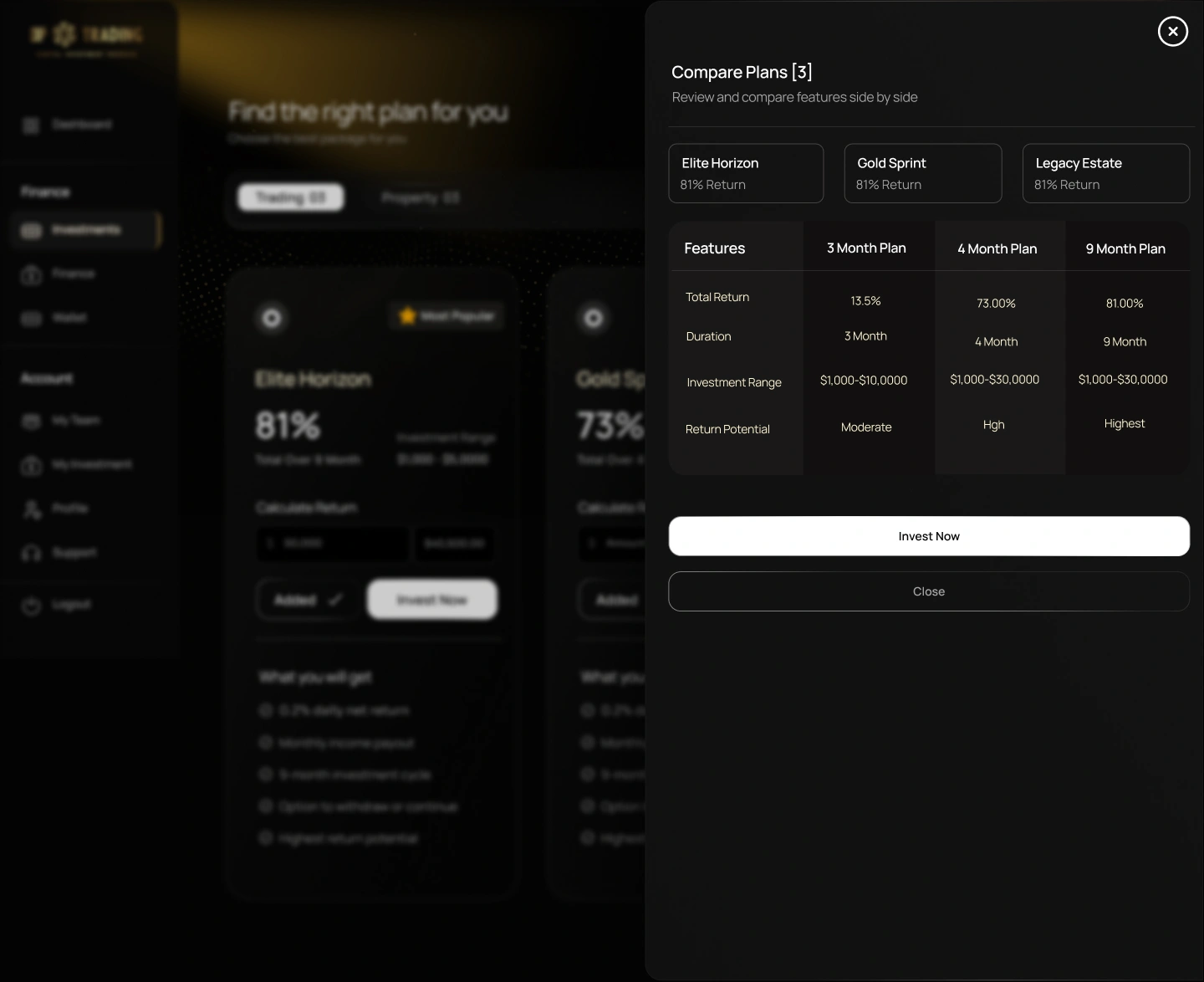
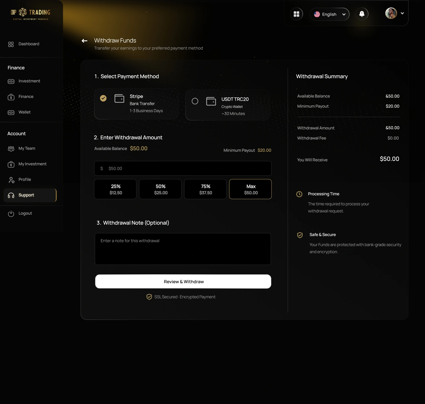
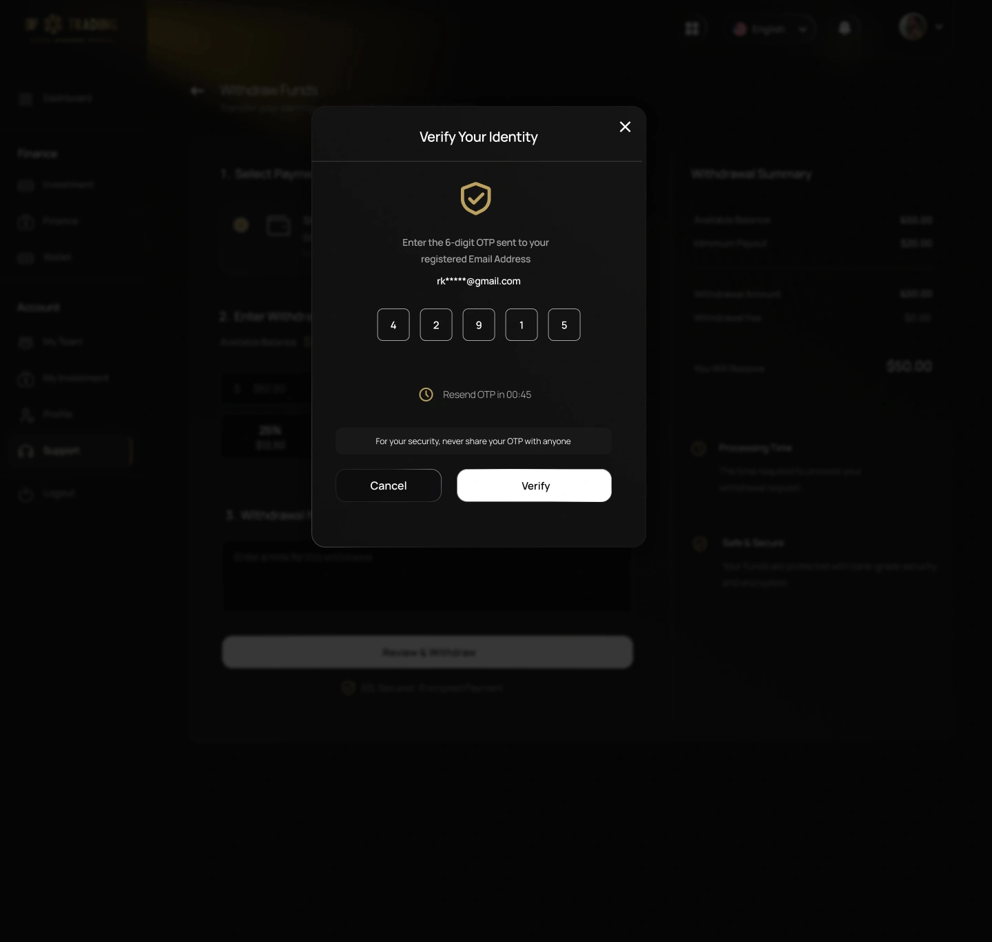
Key dashboard tasks were designed as clear sequences of states — from choosing and comparing investment plans to verifying a withdrawal.
- 01
Navigation
Back links and numbered steps guide people through multi-step tasks like withdrawals.
- 02
Clarity
Selected states — the chosen payment method, active filters and added plans — are clearly marked.
- 03
Feedback
Quick-select amounts, a live withdrawal summary and a resend-OTP timer respond as people act.
- 04
Smoother experience
Comparison and verification open as overlays above a dimmed page, so people keep their place.
01
Choose and compare plans
Plans added from the cards collect in a tray; Compare Plans opens a side-by-side panel over the page.
Step 1Plans selected 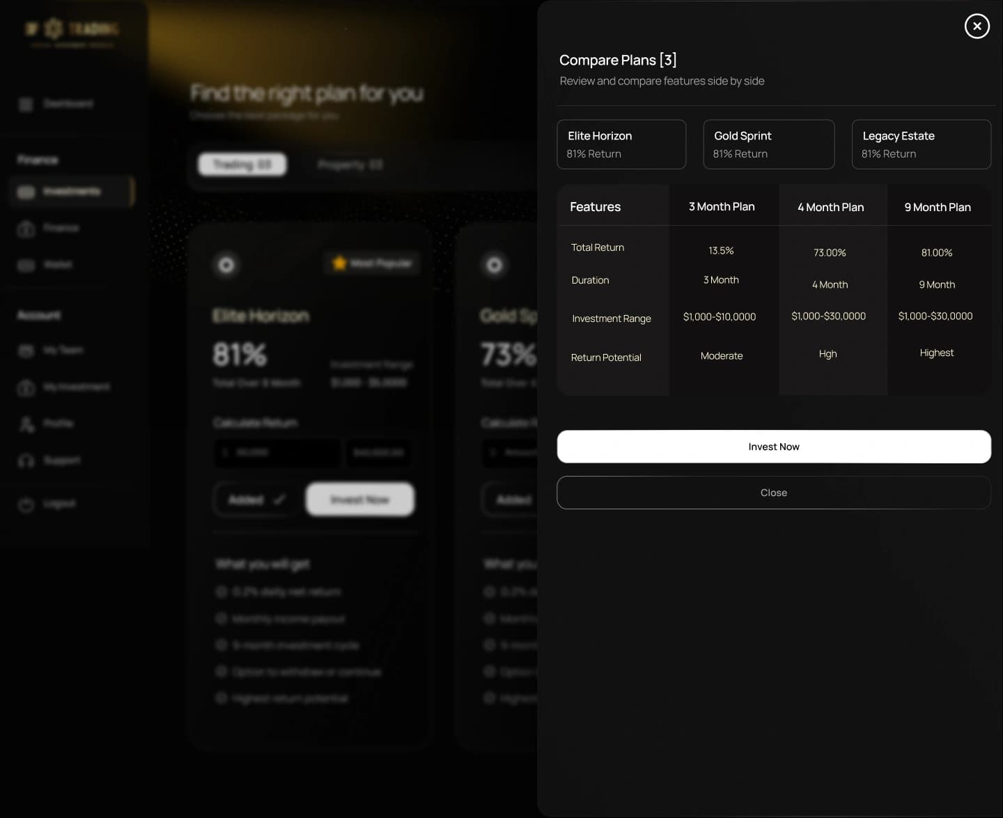
Step 2Comparison panel 02
Secure withdrawal
A three-step withdrawal form leads into an identity check, with a one-time code before funds move.
Step 1Withdrawal form 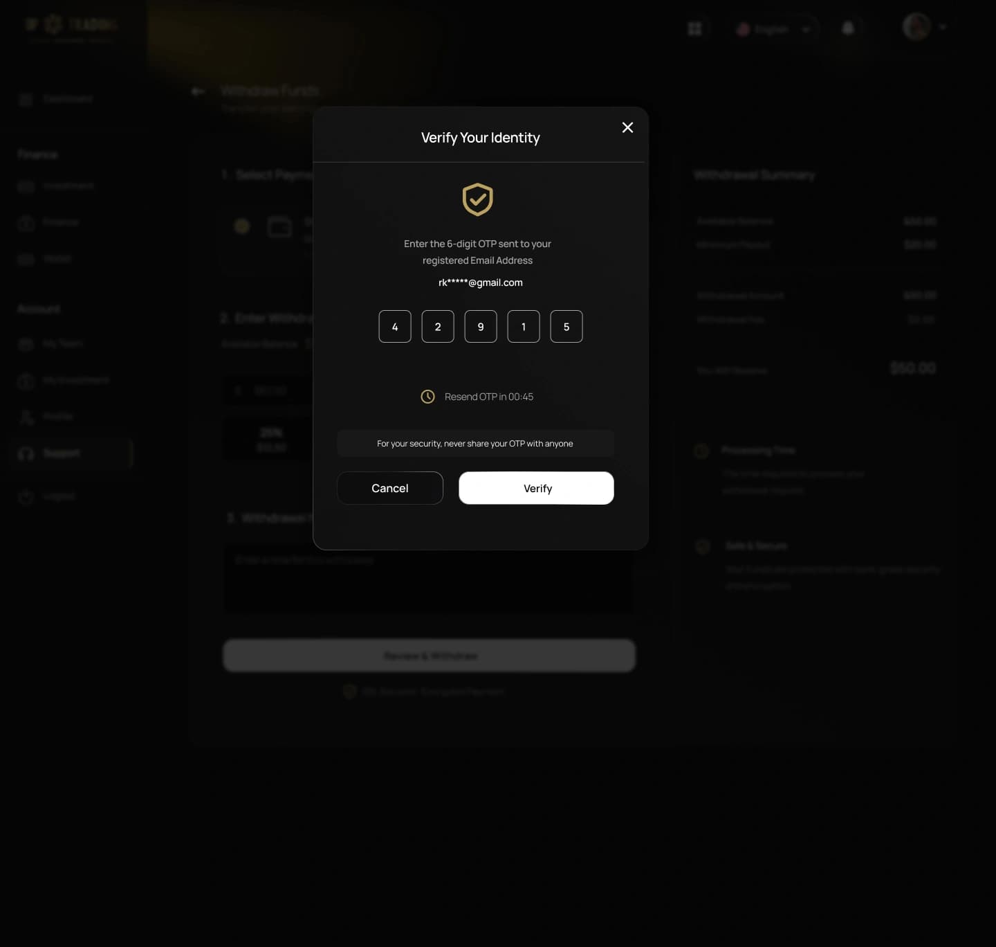
Step 2OTP verification
07Design outcome
Design Outcome
A cohesive design across the DIP Trading landing page and dashboard: one black-and-gold visual system, a clear hierarchy for financial information, and interaction design that carries through the dashboard experience.
Next case study
Vakmi
An AI voice-to-text assistant: speak in any of 22+ Indian languages and get polished, professional writing.